How to Insert and Customize Sparklines in Google Sheets

Create mini charts in your spreadsheets to give your data a small visual. You can insert and customize sparklines in Google Sheets.
Sparklines are nifty mini charts that take up only a cell’s worth of space in a spreadsheet. This lets you display your data visually without the need for much space at all, so they work well in many situations.
Microsoft Excel offers a specific feature to insert sparklines, but Google Sheets doesn’t currently offer such a feature. However, that doesn’t mean you can’t use sparklines in Sheets, you just have to go about it a little differently. Here, we’ll show you how to insert and customize sparklines in Google Sheets.
Insert a Basic Sparkline in Google Sheets
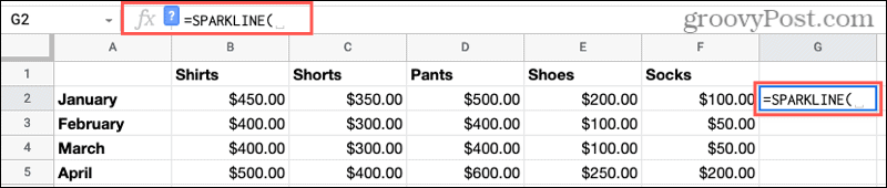
We’ll first show you how to insert a basic sparkline to get you started. So, head to Google Sheets, sign in, and open the spreadsheet you want to use.
- Select the cell where you want the sparkline.
- Go up to the formula bar and type: =SPARKLINE and hit your Enter or Return key.

- You may see a small pop-up below the formula bar with the syntax you can use the customize your sparkline. You can click the X to close that box if you like and reopen it anytime by clicking the question mark in the formula bar.
- Your cursor should still be in the formula bar waiting for the cells you want to use for the sparkline. You can enter the cell range or simply drag through it which will populate the range for you.
- Hit your Enter or Return key and you should see your newly created sparkline.

The default type of chart Google Sheets uses for a sparkline is a line chart. And while this type of graph can accomplish what you need, you might find a different kind more useful.

Sparkline Chart Types and Options
Aside from a line chart, you can use a bar, column, or win/loss graph for your sparkline. You’ll simply add more options to the sparkline function.
The basic syntax: =SPARKLINE(data, {options})
So after you enter the sparkline function, your data (cell range) comes next, with your options at the end. Here are the example formulas you’d use for the other chart types.
- Bar chart: =SPARKLINE(data, {“charttype”, “bar”})
- Column chart: =SPARKLINE(data, {“charttype”, “column”})
- Win/Loss chart: =SPARKLINE(data, {“charttype”, “winloss”})

Each chart type offers its own attributes that can also be added to the formula. This lets you customize things like colors, line width, minimum or maximum value, alignment, and more.
Google offers an inclusive list of options for the sparkline chart type in their help section. So here, we’ll use just a handful of samples.
Line Chart Customization
Since a line chart is just one color, you can actually set it by changing the font color for the cell. So for this example, we just want our line to be wider.
=SPARKLINE(B2:F2, {"linewidth", 5})Now our line is much thicker and easier to see:
![]()
Bar Chart Customization
For this example, we’re going to change the colors of the bar chart. First, we add the “charttype” option and then the “color1” and “color2” sets.
=SPARKLINE(B2:F2, {"charttype", "bar"; “color1”, “red”; “color2”, “blue”})And for the data we’re using, our bar sparkline chart would look like this:

Column Chart Customization
The next example is for a column chart where we want the highest value columns a specific color.
=SPARKLINE(B4:F4, {"charttype", "column"; "highcolor", "green"})Here’s the data for the sparkline and how it looks:

Win/Loss Customization
For our win/loss chart, we want to add an axis and color it red.
=SPARKLINE(B5:F5, {"charttype", "winloss"; "axis", true; "axiscolor", "red"})Take a look at how our win/loss sparkline looks:

Notes on Colors for Sparklines in Google Sheets
Here are just a few notes when customizing your sparkline with colors.
- Like you can set the color for a line chart by changing the font color for the cell, you can do the same for a win/loss chart.
- When you add color to a formula, you can use either the color name or the six-character hex code for the color.
As a reminder, you can check Google’s Docs Editors Help section for additional sparkline chart attributes, values, and definitions.
Google Sheets Sparkline Mini Charts Make Great Visuals
Once you start using sparklines, you’ll be surprised at just how handy they can be. This type of space-saving chart might be just the ticket to a nice and neat visual of your data without distracting from it.
For more on using charts, take a look at how to work with regular charts in Google Sheets or how to insert and edit a chart in Google Docs.


