How to Create and Customize a Chart in Google Sheets

Create a chart in Google Sheets to call out specific data or provide a unique way to view it. You can easily customize the chart and its appearance.
Sometimes a spreadsheet can contain an enormous amount of data. So when it’s time to analyze that data or share the sheet with someone else, it can be overwhelming. However, a tool like a graph or chart not only displays your data in a unique form but also let you call out certain data for a clearer visual amidst the chaos.
Like Microsoft Excel, Google Sheets offers a handy feature for creating a chart easily. You can choose from several chart types and completely customize the chart for the ideal appearance.
Create a Chart in Google Sheets
If you have data that would fit perfectly into a chart, head to Google Sheets, sign in, and open your spreadsheet. Follow these steps to create the chart.
- Select the data for the chart. You can do this by dragging through the cells you want to use.
- Click Insert > Chart from the menu.
- You’ll immediately see your chart, using a suggested style. And the Chart Editor will open on the right. So you can click the Chart Type drop-down list and pick a different style like a line, area, bar, or pie chart.
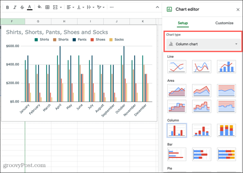

Depending on the type of chart you use, the remaining Setup options in the Chart Editor will vary. For instance, if you choose a column, area, or waterfall chart, you can apply Stacking.
Data Range
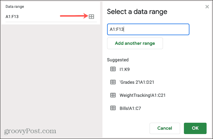
For all chart types, you can see the Data Range. So if you need to make an adjustment or want to add another range, click the Select Data Range icon.

Axis and Aggregate
You can remove or add labels to the X- or Y-axis by clicking the Options (three dots) icon on the right of that item. If you’d like to Aggregate the data, check that box and then pick average, sum, count, or another option in the drop-down list.


Series
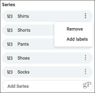
You have options to remove a series or add labels by clicking the three dots to the right of one. Or you can click Add Series at the bottom of the list for additional data.

Other Options
At the bottom of the Chart Editor, you also have the ability to switch rows and columns, use row 1 as chart headers, and use column A as labels. Just check the boxes next to the items you want to apply.


Move or Resize
- To move your chart to a different spot on your sheet, simply grab it and drag where you want it.
- To resize your chart, select it and drag from one of the corners or borders.
Customize Your Chart
Once you create your chart and organize the data as you like, you have ways to customize the chart. This lets you apply changes to the appearance like color, style, and gridlines.
If you’ve already closed the Chart Editor, you can reopen it easily. Click the three dots on the top right of the chart and select Edit Chart.
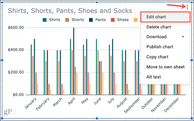

In the Chart Editor, click the Customize tab at the top. You’ll see several options for changing the appearance of your chart, each can be collapsed or expanded. These options vary depending on your chart type.
Chart Style: Change the background color, font, border, and overall look.
Chart & Axis Titles: Add text for the chart title, subtitle, horizontal, or vertical axis titles. Then, choose the font style, size, format, and color for those you use.
Series: Format the axis position and data point and select colors for items in the series.


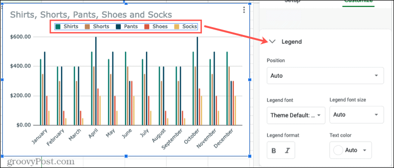
Legend: Add, remove, and position the legend on the chart. You can also format the font.
Horizontal Axis and Vertical Axis: Adjust the font style, size, format, and color for the selected axis. You also have options to slant the labels on the horizontal axis and choose a scale factor for the vertical axis.
Gridlines and Ticks: Choose the spacing types and counts, add major and minor ticks, and pick the gridline color.


Again, the options in the Customize section of the Chart Editor depend on the chart you use. So if you pick a pie chart, for example, you can add a donut hole and select its size.
Time-Saving Tip: Not sure which section of the Chart Editor you need to access for a particular part of the chart? Make sure the Chart Editor is open and then click the item directly on the chart. This action will display the expanded corresponding area in the Chart Editor to make your edits.

Create a Chart in Google Sheets for Data Visualization
If you want to call attention to particular data or simply view your data in a visually pleasing way, create a chart in Google Sheets. You have complete flexibility with how your chart looks and the data it shows.
Need a little help with charts in Microsoft Excel? Take a look at our walk-through for creating a Gantt chart in Excel. Or check out how to create a pie chart in Excel 2010 if you are running an older version of Office.


